Flexbox — Everything You Need to Know (Part: 1 — Flex-Container)
Flexbox had appeared as a blessing for all frontend web developers. Before its arrival, designing a complex layout required too many works. Flexbox made our walking toward complex web UIs easier as well as faster. And in this era of modern web design, we can not think of an interactive UI without flexbox. In this article, we’ll discuss flexbox in-detail and play with various flex properties. So, guys, are you ready? Let’s kick it off.
Okay, before starting, can you tell me why we’re calling it FLexbox? Yes, you are right. The answer is “Because of being flexible”. Layout designed by the flexbox can easily resize and organize its elements to make the layout responsive.
Flex Components
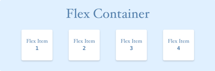
To use Flexbox we need at least two components. They are —
-
Flex Parent or Flex Container:— Mainly it contains a bunch of elements and applies flex properties upon them.
-
Flex Child or Flex Item:— Elements that are arranged inside the flex-container.
Images made with ❤️ by Myself
Flex Axes
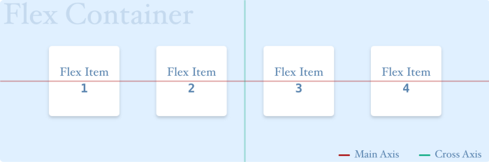
Flexbox has two axes —
-
Main Axis:— Elements inside of the flex container are arranged along with this axis. By default, this axis is set in the horizontal direction.
-
Cross Axis:— By default, this axis is set in the Vertical direction, perpendicular to the main axis.
But this arrangement of flex axes is not fixed all the time. It can be changed using the flex-direction property.
Images made with ❤️ by Myself
Flex Properties
In flexbox, we have 2 types of elements. One is Flex Container and the other is Flex Item. For both of them, there are different flex properties. All of them are listed below —
Flex Container:—
- Display
- Width & Height
- Flex Direction
- Flex Wrap
- Justify Content
- Align Content
- Align Items
Flex Item:—
- Height & Width
- Order
- Flex Basis
- Flex Grow
- Flex Shrink
- Align Self
- Margin
In this part, we are going to discuss flex-container. But We will discuss them all in several parts. So nothing to worry. Hopefully, it’ll be a nice journey in the flex world to all.
Properties for Flex Container
display
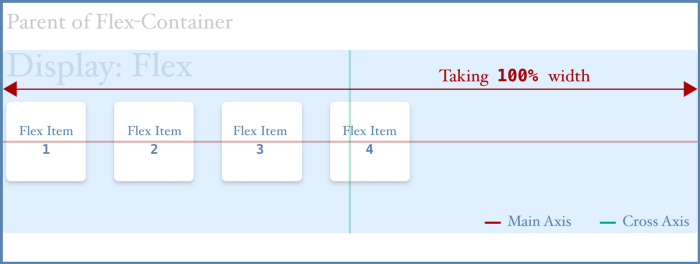
By this property, we can define an HTML element as a flex-container. It’s a must required property for using flexbox. It has the following values —
display: "flex" || "inline-flex"
- flex: It invokes the flex container to act as a block-level element. That means it takes the full width of its parent if there is no fixed width assigned for the flex container.
Images made with ❤️ by Myself
- inline-flex: This invokes the flex container to act as an inline-level element. The main difference between flex & inline-flex is that the flex container takes the space needed to wrap its child elements not the full width of its parent. But you still can set the height/width of the inline-flex container.
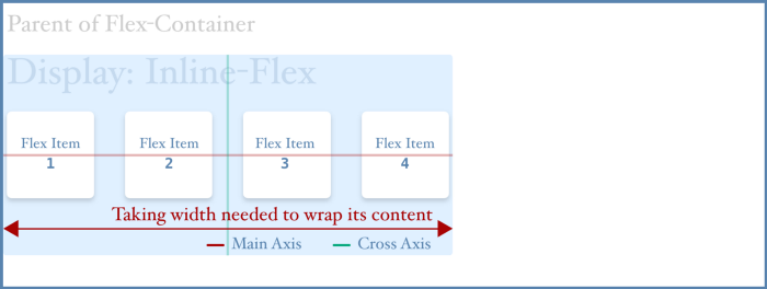
Images made with ❤️ by Myself
Both flex and inline-flex invoke child items to be arranged along with the main axis. By default, it’s from left to right.
width & height
By default, a flex container has the following width and height assigned.
width: auto;
height: auto;
But you can set a fixed height and width to the flex container. And it’ll work for flex and inline-flex also.
flex-direction
Flex-direction property is mainly used for inter-changing between the main and cross axis. It has the following values —
flex-direction: "row" || "column" || "row-reverse" || "column-reverse"
- row: When you use “row”, it defines that the main axis is set in the horizontal direction and flex items will arrange themselves along with the main axis like the following image. This value is set by default.
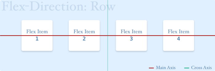
Images made with ❤️ by Myself
- row-reverse: When you use “row-reverse”, it defines that the main axis is set in the horizontal direction like “row” and flex items will arrange themselves along with the main axis but in reverse order like the following image.
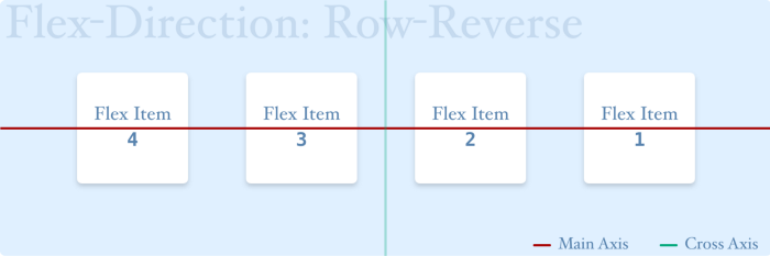
Images made with ❤️ by Myself
- column: When you use “column”, it defines that the main axis is set in the vertical direction and flex items will arrange themselves along with the main axis like the following image.
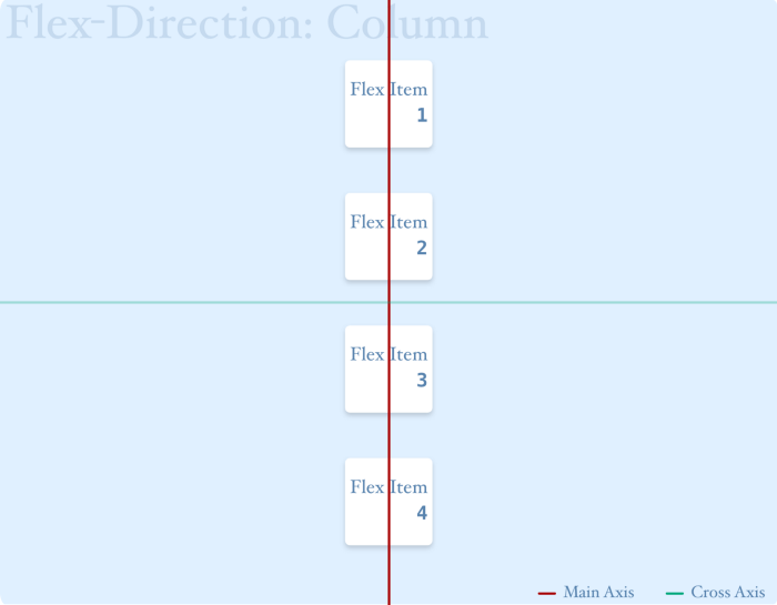
Images made with ❤️ by Myself
- column-reverse: When you use “column-reverse”, it defines that the main axis is set in the vertical direction like “column” and flex items will arrange themselves along with the main axis but in reverse order like the following image.
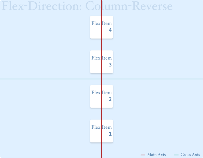
Images made with ❤️ by Myself
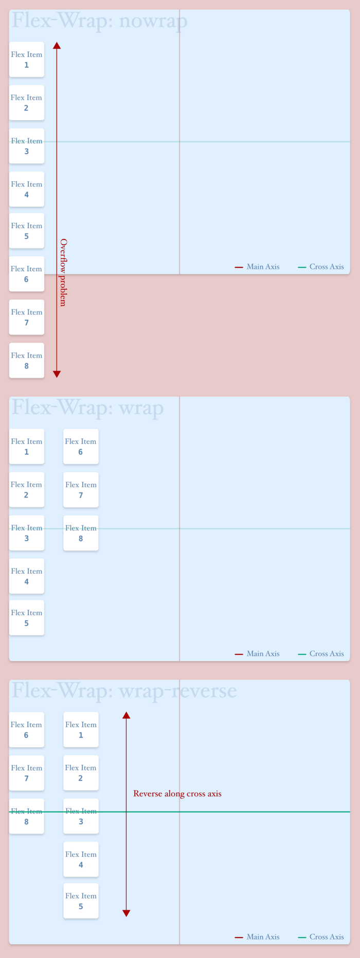
flex-wrap
It defines whether the flex container will wrap flex items or not. It has the following values.
flex-wrap: "nowrap" || "wrap" || "wrap-reverse"
- nowrap: It invokes the flex container to avoid wrapping its child-elements. And it also causes overflow problem like the following picture. This value is set by default.
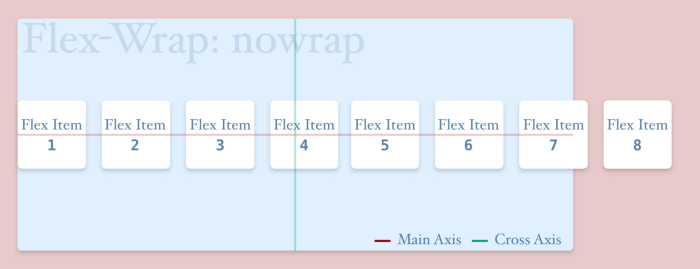
Images made with ❤️ by Myself
- wrap: When flex items tend to cause an overflow, flex container wraps them. Look at the following picture to understand.
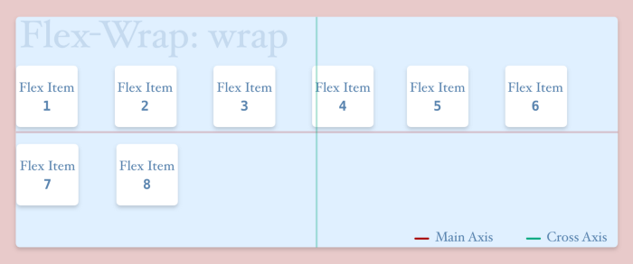
Images made with ❤️ by Myself
- wrap-reverse: It behaves like “wrap” but after wrapping flex items, it arranges rows in the reverse direction along the cross axis like the following picture.
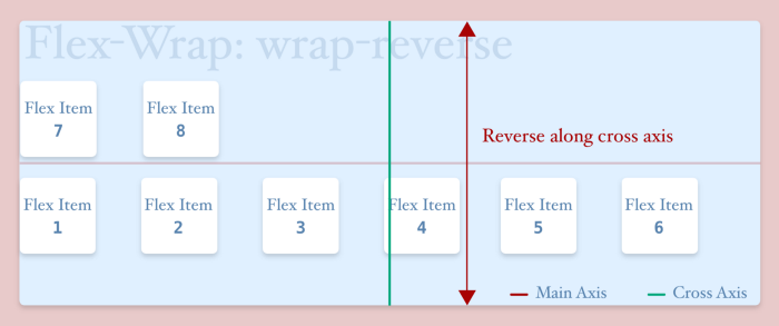
Images made with ❤️ by Myself
But the above pictures will be changed if the flex-direction property is set to the column. Pictures for flex-direction: column is given below.
Images made with ❤️ by Myself
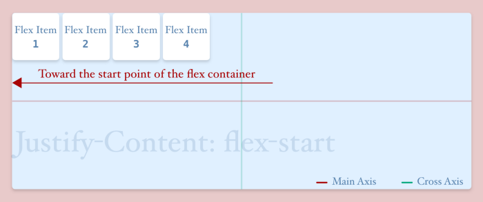
justify-content
This property is used to define how flex items will arrange themselves along with the main axis. It has the following values—
justify-content: "flex-start" || "flex-end" || "center" || "space-around" || "space-between" || "space-evenly"
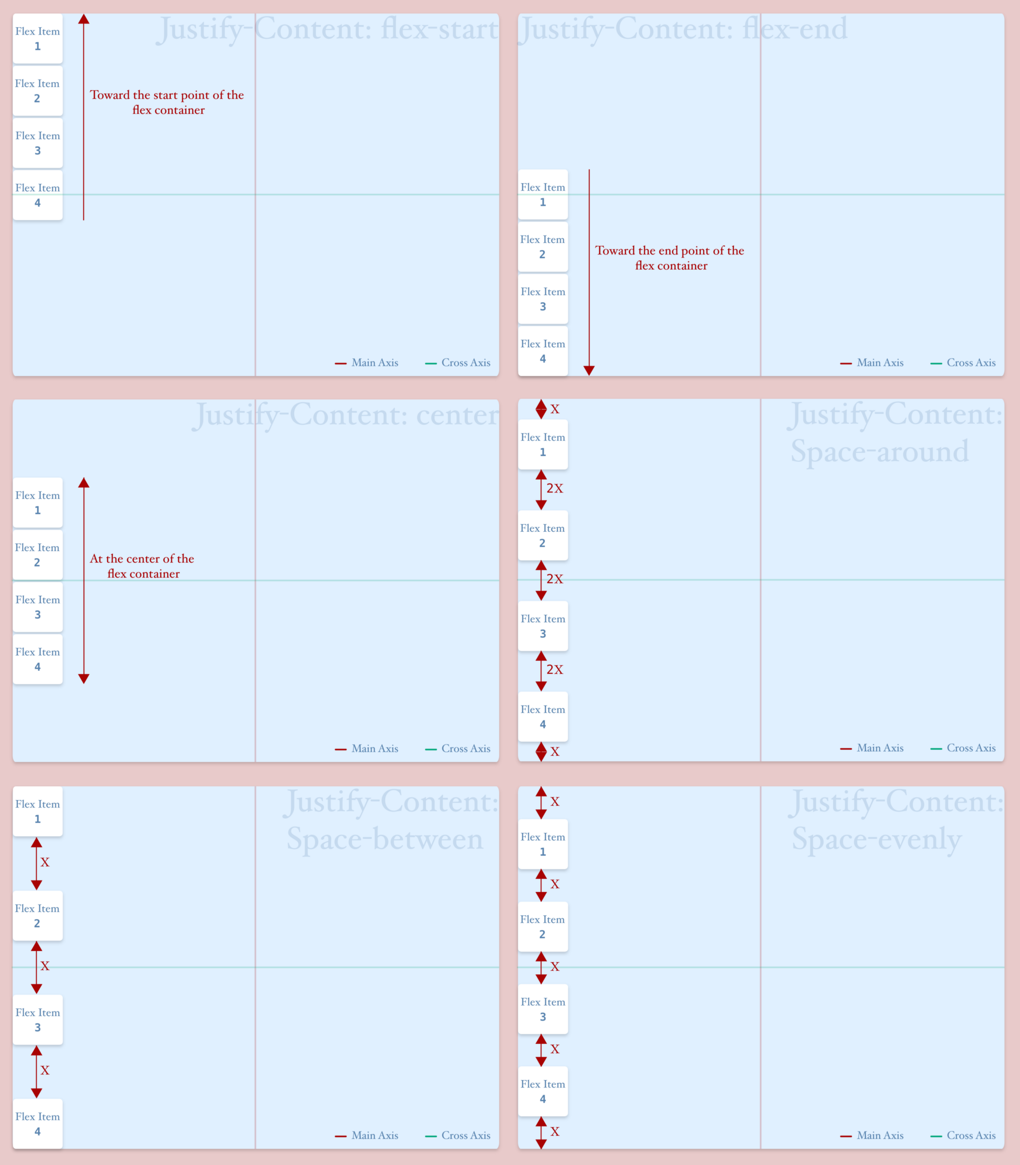
- flex-start: It’s the default value of justify-content. Using this value, we can pack flex items toward the start point of the flex container along the main axis.
Images made with ❤️ by Myself
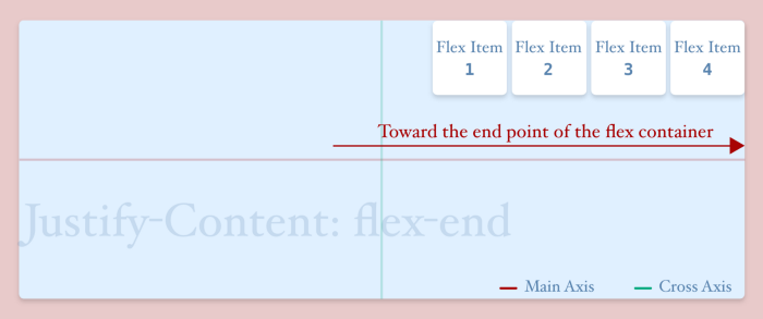
- flex-end: Using this value, we can pack flex items toward the endpoint of the flex container along the main axis.
Images made with ❤️ by Myself
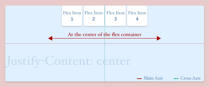
- center: Using this value, we can pack flex items at the center of the flex container along the main axis.
Images made with ❤️ by Myself
- space-around: This value ensures equal space between the outermost flex items and the container and this space is half of the space between two flex items. Look at the following picture. Here the space between two flex items is “2x”. And the space between the outermost flex items and the container is “x”.
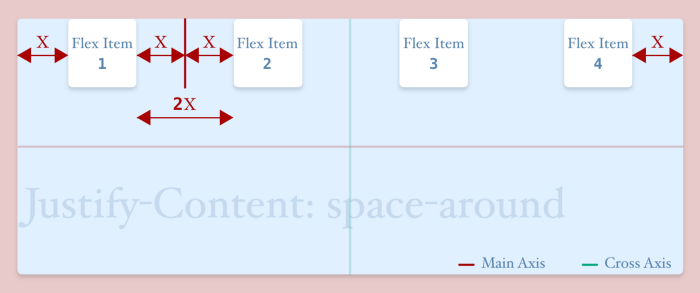
Images made with ❤️ by Myself
- space-between: It doesn’t think about the space between the flex item and the container. It puts zero space (if flex items have no margin) between the outermost flex items and the flex container but puts equal space between two flex items. You will easily understand this from the following picture.
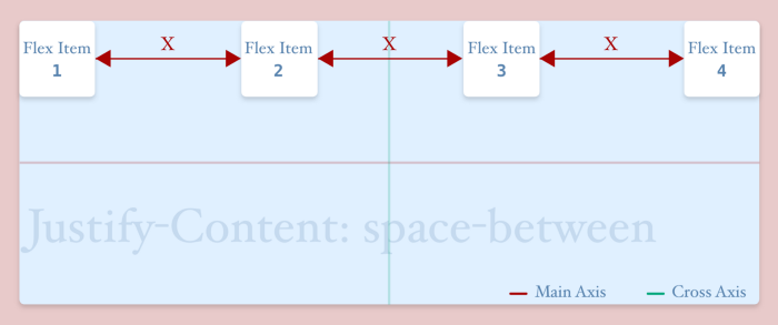
Images made with ❤️ by Myself
- space-evenly: This puts equal space between the outermost flex-items and the flex-container as well as the space between two flex items. In the following picture, you can clearly understand that.
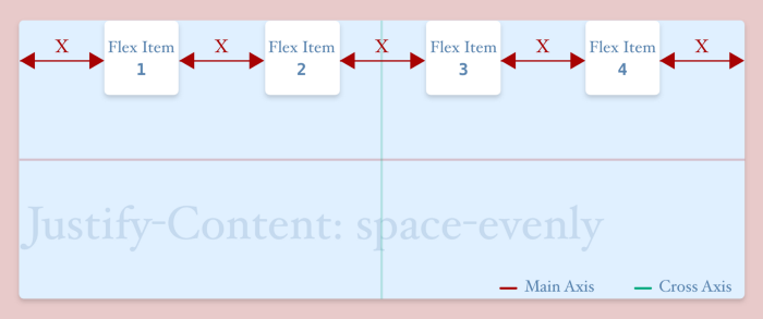
Images made with ❤️ by Myself
But as the property “justify-content” depends on the main axis, the above pictures will change when the main axis will change (ex: for flex-direction: column). And the changes are given in the following pictures.
Images made with ❤️ by Myself
align-items
This property is used to define how flex items will arrange themselves along with the cross axis. It has the following values—
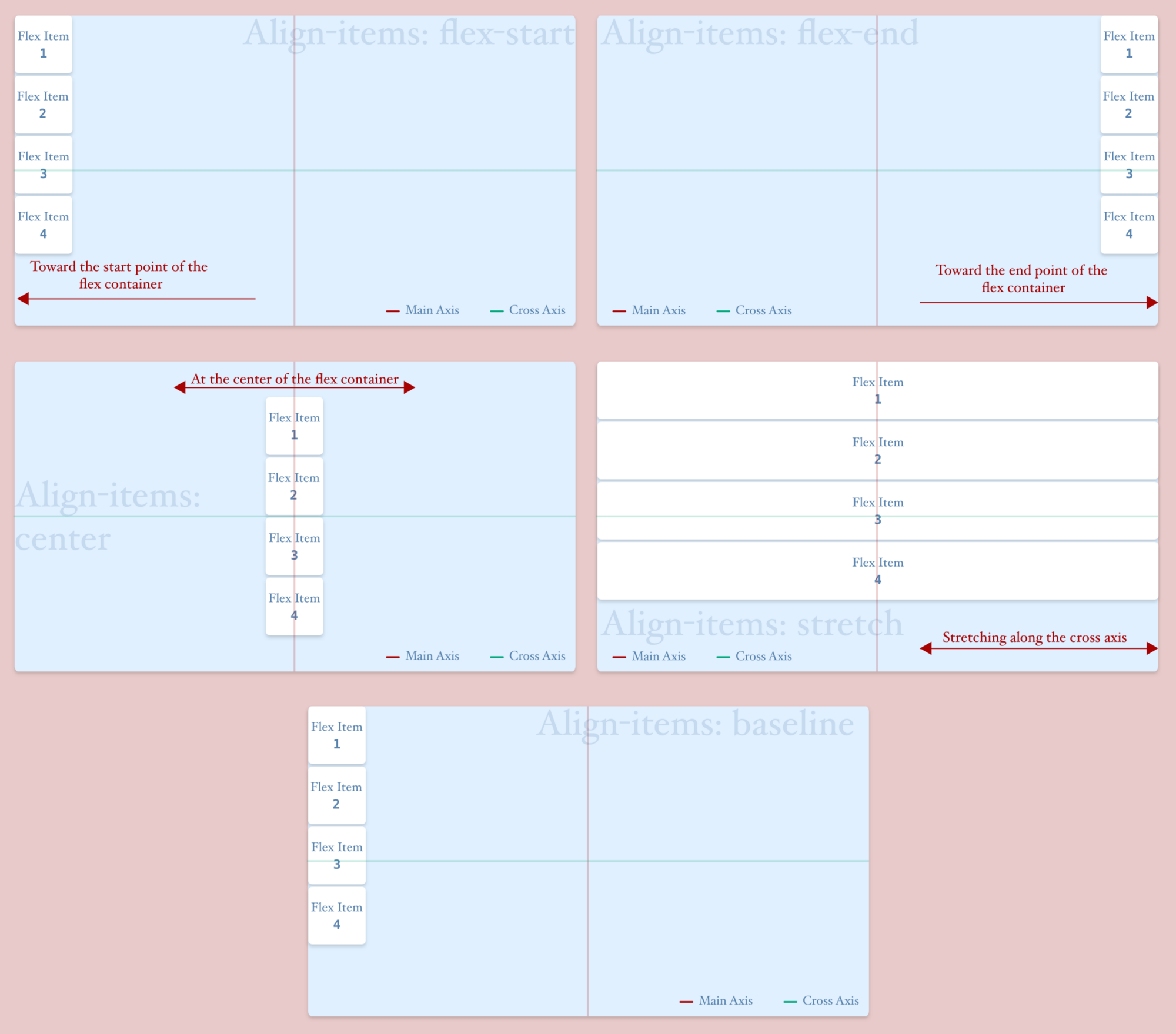
align-items: "flex-start" || "flex-end" || "center" || "stretch" || "baseline"
- flex-start: This value is used for packing the flex items towards the starting point of the container along with the cross axis.
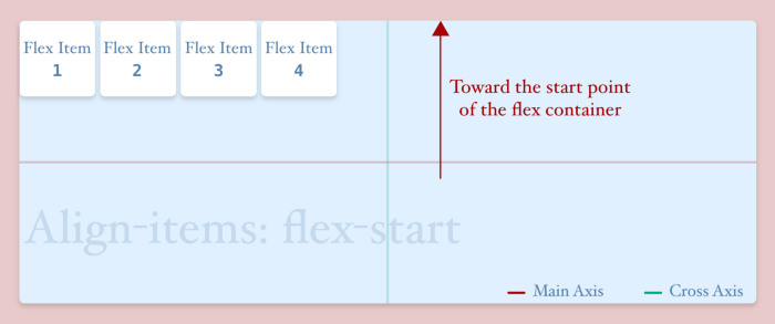
Images made with ❤️ by Myself
- flex-end: This value is used for packing the flex items towards the ending point of the container along with the cross axis.
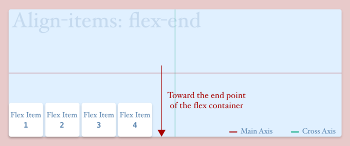
Images made with ❤️ by Myself
- center: This value is used for packing the flex items at the center of the container along with the cross axis.
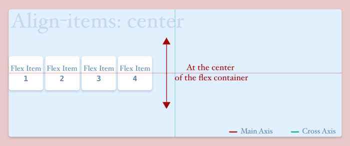
Images made with ❤️ by Myself
- stretch: This value is responsible for stretching the flex items to fill the available space in the container towards the cross axis (if no fixed height is given to flex items). This value is set by default.
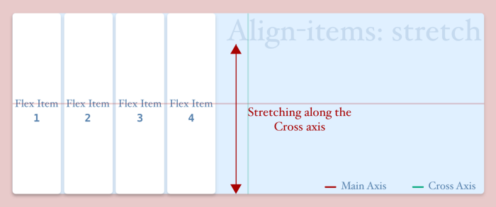
Images made with ❤️ by Myself
- baseline: This value arranges flex items by aligning their baselines. To understand what the baseline is, please see the following pictures.
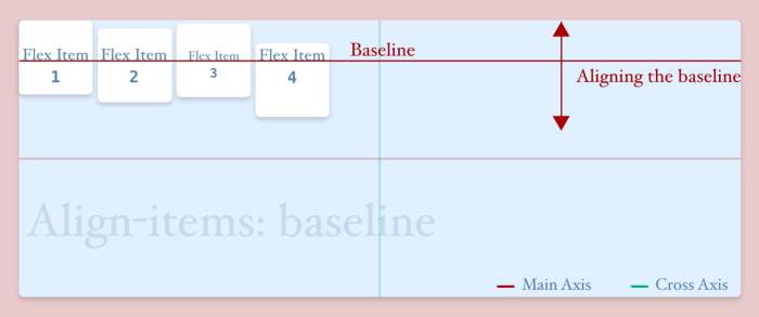
Images made with ❤️ by Myself
This property depends on the cross axis, the above pictures will change when the cross axis will change (ex: for flex-direction: column). And the changes are given in the following pictures. All pictures have been given assuming “justify-content: flex-start”.
Images made with ❤️ by Myself
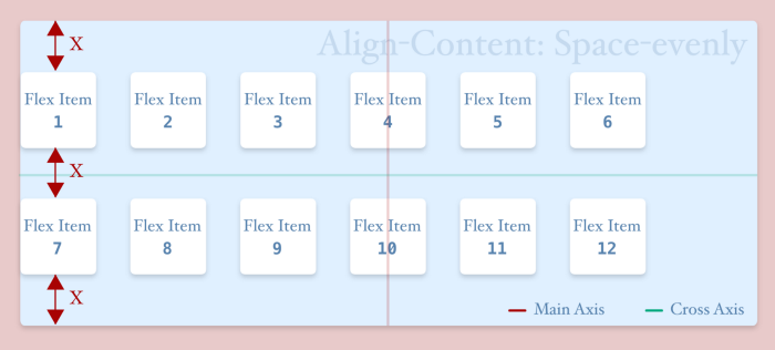
align-content
This property defines how rows inside a flex container will be aligned along with the cross-axis. But the effect of this property can’t be realized if there is only one row inside the flex container as well as if there is a different value set to “align-items”. Actually, it works as same as “align-items”. Just instead of aligning items inside a single row, it aligns all the rows. It has the following properties—
align-content: "stretch" || "flex-start" || "flex-end" || "center" || "space-around" || "space-between" || "space-evenly"
- stretch: It’s the default value for align-content. It stretches flex items to fill the available spaces allotted for every row in the flex container, just like the following picture.
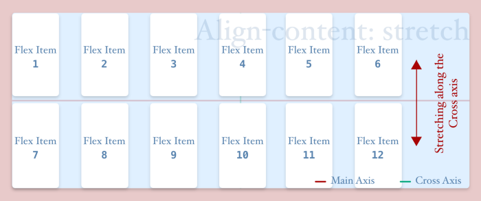
Images made with ❤️ by Myself
- flex-start: This value packs all the rows towards the start point of the flex container along with the cross-axis.
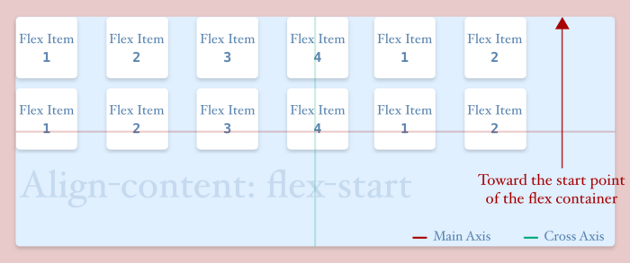
Images made with ❤️ by Myself
- flex-end: This value packs all the rows towards the endpoint of the flex container along with the cross-axis.
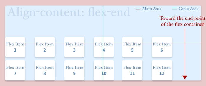
Images made with ❤️ by Myself
- center: This value packs all the rows at the center of the flex container along with the cross-axis.
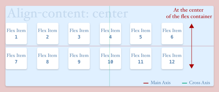
Images made with ❤️ by Myself
- space-around: This value ensures equal space between the outermost rows and the container and this space is half of the space between two rows. You can compare with justify-content: space-around. It seems to be easier to remember.
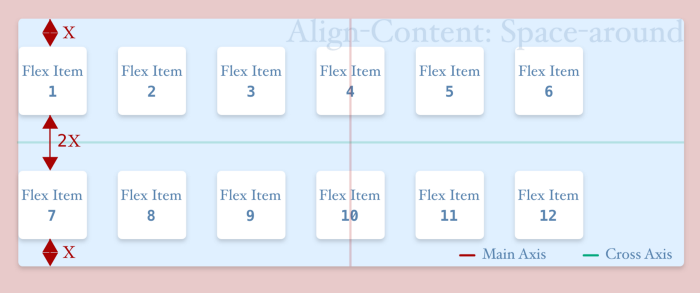
Images made with ❤️ by Myself
- space-between: It puts zero space (if flex items have no margin) between the outermost rows and the flex container but puts equal space between two rows.
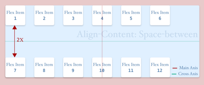
Images made with ❤️ by Myself
- space-evenly: This puts equal space between the outermost rows and the flex-container as well as the space between two rows.
Images made with ❤️ by Myself
This property also depends on the cross axis, the above pictures will change when the cross axis will change (ex: for flex-direction: column or column-reverse). And the changes are given in the following pictures. All pictures have been given assuming “justify-content: flex-start”.

Images made with ❤️ by Myself
The Takeaways
Flexbox is a cool feature of CSS3 which gives us the facility of making flexible layouts. While using Flexbox, we have to keep the following points in mind:
-
Flexbox need at least two-tier components: flex-container & flex-item.
-
Flexbox has two axes: main and cross axis. By default, the main axis is set in the horizontal direction and cross-axis in the vertical direction. But this arrangement is not fixed. It can be changed by using the flex-direction property.
-
To use flexbox, we have to set display: flex or inline-flex to flex-container.
-
By default, the height and width of a flex-container are set to auto. But we can define a fixed amount to them.
-
Flex-direction is used for defining the arrangement of flex axes. For row (default) and row-reverse, it sets the main axis in the horizontal and cross-axis in the vertical direction. But for column and column-reverse it will exchange their positions.
-
If we want to avoid overflow in flex-container, we have to use flex-wrap: wrap or wrap-reverse. Otherwise, it will take nowrap as default and will be overflowed when flex-items are shrunk enough.
-
Justify-content is used to align items along with the main axis.
-
Align-items is used for aligning items along with the cross axis.
-
Align-content is used for aligning rows inside the flex container along with the cross-axis.
Conclusion
At this time, flex-box is the most used technology for layout building. Even maximum popular frameworks like Bootstrap, Bulma, Reflex-grid, etc. are using flexbox for building their layout. And it’s so easy to use flexbox as it can flexibly arrange its items. We don’t need to calculate pixels for height, width, margin, padding, etc. That’s why it’s so cool. So start to dig in flexbox.
If you want to play with flexbox, then FLEXO would be a great tool for you. Try this at home, office, anywhere you want 😜 😜 😜
And Like every time, also this time I wanna say, “feel emotions, build emotions, and spread emotions by Coding.
Flexbox — Everything You Need to Know (Part: 2— Flex-Items) is coming soon.
Till then stay tuned, stay home, and help to fight against Corona Virus. Bye for now. Happy Coding… ❤️ ❤️ ❤️
If you find this article useful and like it, feel free to share it so more people can take benefit from it. You can connect with me and discuss this article on LinkedIn or my website.