Gestalt Principles: Secrets of Hacking Human Brain by Design

When you saw the following picture, what came to your mind? A human face or a large tree? Yes, maybe I can guess your answer! Because the study says that 80% of people see it as a human face. And that’s the ultimate way in which our brain works.
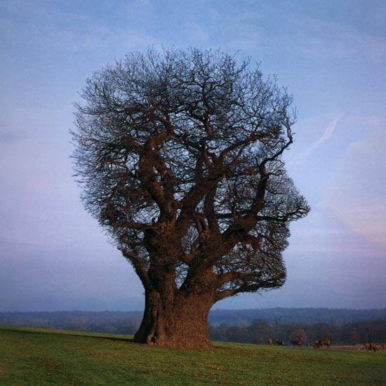
Image Source (steemit.com)
When we see any complex structure, our brain makes sense of the structure depending on any shapes from our previous experience. And because of that most people think of the picture as a human face for the first time. There are many other psychological rules that our brain follows. These rules are called together as gestalt principles.
What does Gestalt mean?
Gestalt is a German word that means shape, structure, etc. It was founded by Max Wertheimer in the early 20th century. When we see something, our brain tries to make a sense of whole instead of focusing on individual parts. That’s why most people see the previous image as a human face instead of leaves. In a nutshell, Gestalt principles discuss how properties of individual parts affect the expression of the whole image.
The whole is other than the sum of the parts — Kurt Koffka
And that’s the main theme of gestalt principles. Mainly it discusses how humans perceive any visual representation. In this article, we’ll talk about the following Gestalt principles and try to relate them with real-life UI/UX designs.
- Closure
- Proximity
- Similarity
- Common Region
- Figure-Ground
- Focal Point
- Continuity
#1 Principle of Closure
What is it?
This principle is a common behavior of the human brain. It states that when we see any complex structure of visual elements, our brain looks for a single recognizable pattern. Our brain searches for this pattern from our previous experiences. If it gets any match, we’ll see the structure as this matched pattern.
And the principle is also applicable to the images that have missing parts. Our brain tends to fill these gaps and creates a complete recognizable pattern. That’s why we can still recognize the tiger and the football from the following pattern though both of them have some missing parts.


Images are taken from google search
Principle of closure in action
In the present time, the principle of closure is mostly used in logo design and icon design. If you look at the following image where a bunch of logos are being displayed, you can realize how this principle makes an impact on design.
Principle of closure in Logo design (Image by thelogocreative.co.uk)
Principle of closure in Icon design (Image by Jan Kovařík from dribbble.com)
#2 Principle of Proximity
What is it?
According to this principle, our brain perceives things as a group based on their relative distance. Things that are close together appear to be more related than things that are in a distance from each other. These words seem to be difficult at the beginning 😞. Don’t be upset. I’ve made an image with ❤️ for you. And I am confidently saying that from the following image you’ll get a clear idea of this principle. Let’s dive deeper.
Here you can see a bunch of boxes arranged in two ways. When you’re seeing at the left side’s arrangement, this appears to be one single group. But at the right side’s arrangement, the same amount of boxes appears to be three different groups. And that’s only for spaces used among boxes at the right side’s arrangement.
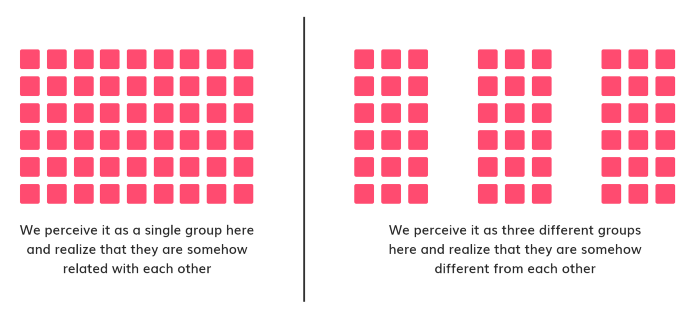
Images made with ❤️ by Myself
Even proximity is more powerful than color in the case of grouping elements. See the following image. Here both arrangements indicate the existence of three different groups. But the second one (on the right side) is more clear.
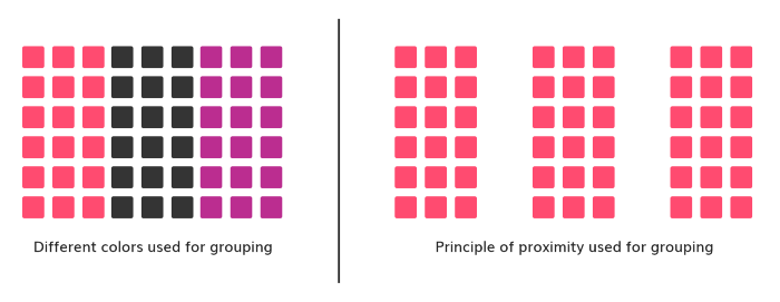
Images made with ❤️ by Myself
Principle of proximity in action
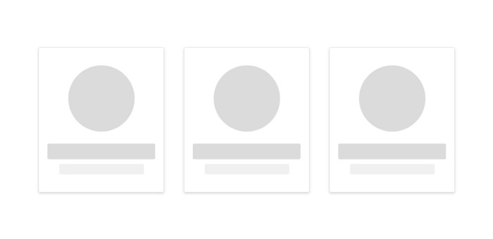
Daraz (An online shop) uses the principle of proximity in its product showcasing. Here the image, name, cost, offer, and rating of each product appear to be one single group (one product) and still, you can differentiate two products because of the spacing used between them.

Screenshot of Daraz Online Shop
#3 Principle of Similarity
What is it?
Objects that share visual properties (size, color, texture, dimension, shape, or orientation) appear to be similar. The human brain makes groups of objects based on similarity. This is the main theme of the principle of similarity.
Consistent sequences of actions should be required in similar situations; identical terminology should be used in prompts, menus, and help screens; and consistent color, layout, capitalization, fonts, and so on, should be employed throughout. — Ben Shneiderman
When you see the following image, objects appear to be two different groups. One is the circle and the other is the square. And that happens due to their shape and color. Whenever you are seeing a circle shape with black color in the image below, you categorize it in the same group with other circles and all the circles have the same color and shape.
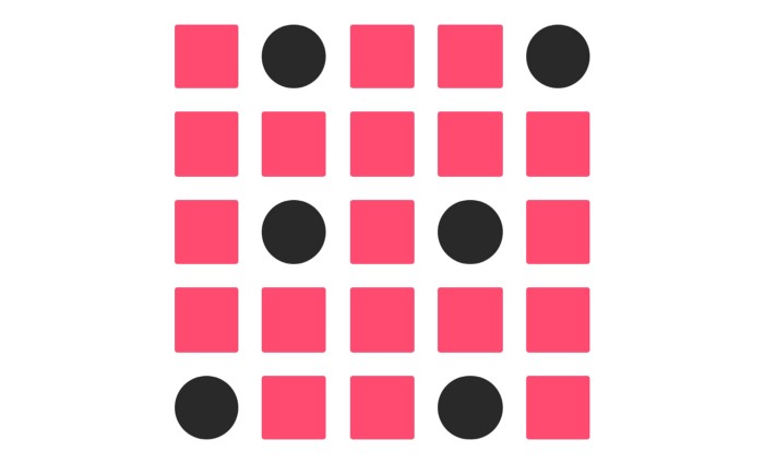
Images made with ❤️ by Myself
Principle of similarity in action
Popupology (A kirigamy product selling website) uses this principle in categorizing cards that can be folded. Here you can recognize a foldable card by seeing the orange label above the card. This orange label is representing the similarity among foldable cards.
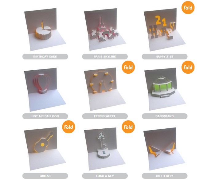
Screenshot of Popupology
#4 Principle of Common Region
What is it?
The principle of common region states that objects bounded in a close region, appear to be a single group. But a few moments ago I said that proximity also has an impact on grouping. Now, what will happen if the common region and proximity both are applied in the same UI design?
Not to be worried. It is possible to use proximity and common region principles together. In the following picture, a row of cards is shown. Here border and shadow have been used together to make the common region and this region is giving you the feel of a card. You can also see that elements inside each card appear to be different from other cards though all cards are maintaining the principle of proximity i.e. they are in the same distance.
Images made with ❤️ by Myself
Principle of common region in action
In the following image of Foodpanda (Online based food delivery service), you can see the use of both common region and proximity principle in grouping items. Images including tags and offers are following the principle of common region. But items are following the principle of proximity to separate themselves from each other. Name and ratings are also following proximity principle to represent themselves as different from other items and their names and rating but as related to the image above itself.

Screenshot of Foodpanda
#5 Principle of Figure-Ground
What is it?
Figure-Ground is nothing but the relation between positive element (element to focus) and negative space (background). When we see a picture, first we separate the whole figure from its background to realize what is to be seen. People perceive objects by focusing on either foreground or background.
This determination will occur quickly and subconsciously in most cases. Figure/Ground lets us know what we should be focusing on and what we can safely ignore in a composition. — Steven Bradley, Web Designer
When you see the following image, you will see an apple first. But when you focus on the background (black portion), you will see the shape of Steve jobs.
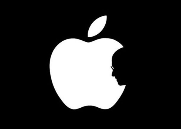
Images made with ❤️ by Myself
Now which part of image will be seen as figure and which will be seen as background depends on two principles:
-
Area: The smaller overlapping area of two objects is seen as figure and the lager one is seen as ground. You can see the above image where the smaller area (white portion — apple) is been seeing as figure and the larger portion (black portion) is been seeing as background.
-
Convexity: Convex patterns tend to be perceived as figures.
Principle of figure-ground in action
Airbnb (An online accommodation rental service) uses the principle of figure-ground in order to focus its login section. Here the smaller area (login form) is seen as figure. To do so, the brightness of the background has been made low.

Screenshot of Airbnb
#6 Principle of Focal Point
What is it?
This principle states that our eye captures those elements which are different from their surrounding elements. In the image below, for example, the first thing that will draw your attention is the red square. Because the red square is different from others (circle).
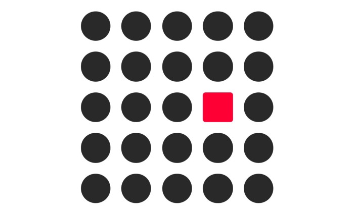
Images made with ❤️ by Myself
The principle of similarity is closely related to the principle of focal point. To be focused, the surrounding elements of an element should be similar.
Principle of focal point in action
This principle is widely used in call-to-action (CTA) buttons in UI designs of modern apps and websites. For example, Udacity (An online learning platform) uses a different color to the 'START FREE COURSE' button in order to make it more focusable. And this technique (the principle of focal point) really works.

Screenshot of Udacity
#7 Principle of Continuity
What is it?
Elements arranged in a line or curve seem to be more related than elements that are not arranged in the line or curve. In the image below, red circles arranged in the straight line appear to be more related than the red circles that are arranged in random.
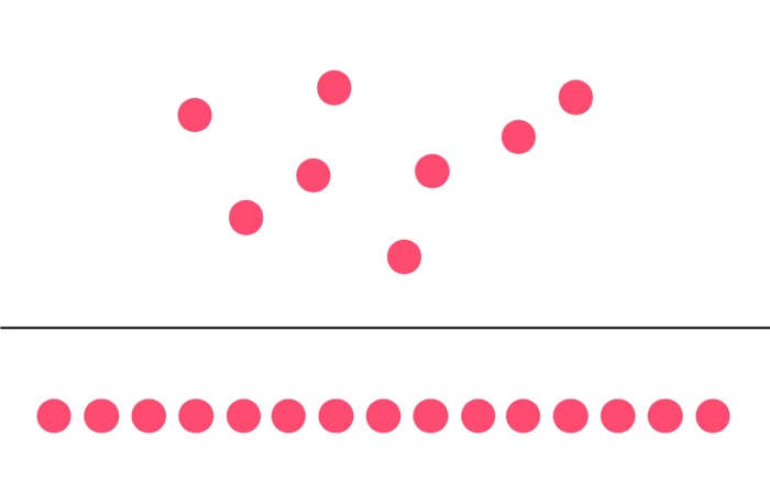
Images made with ❤️ by Myself
Principle of continuity in action
In the example below, Iflix (An online movie streaming site) uses the principle of continuity in the carousel of movie posters. And it’s done by cutting half portions of the posters that are near to the two edges of the viewport. This principle is widely used in carousels, steppers, sliders in apps and websites.
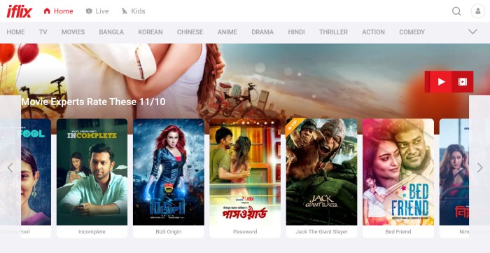
Screenshot of Iflix
The Take-Away
Basically Gestalt principles discuss the way how people perceive any visual representations and why these ways work in such way. In this article, I discussed 7 Gestalt principles: Closure, Proximity, Similarity, Common Region, Figure-Ground, Focal Point, Continuity.
Closure states that our brain tries to recognize any complex structure based on previous experience, even the structure has some missing parts.
Proximity states that things that are close together appear to be more related than things that are in a distance from each other.
Similarity states that objects sharing visual properties (size, color, texture, dimension, shape, or orientation) appear to be similar.
Common Region states that objects bounded in a close region, appear to be a single group.
Figure-Ground states that people perceive objects by focusing on either foreground or background. Which parts of an image will be seen as a figure and which will be seen as background depends on two principles: area, convexity. Smaller area of two overlapping objects and convex patterns tend to be perceived as a figure.
Focal Point states that our eye captures those elements which are different from their surrounding elements.
Continuity states that elements arranged in a line or curve seem to be more related than elements that are not arranged in the line or curve.
Conclusion
User Interface (UI) design is not all about graphics, it’s mainly about the feelings of users. ‘Gestalt principles’ is a very helpful tool to achieve this goal. These principles help to give users a good feeling while using your design. Actually they make a bridge between the design and the emotion of users. So feel emotions, build emotions and spread emotions by Coding.
If you find this article useful and like it, feel free to share it so more people can take benefit from it. You can connect with me and discuss this article on LinkedIn or my website.